Timekeeping Mobile App
Updated a mobile timekeeping experience to match a new Unified Design System while protecting the workflows people relied on daily. Defined mobile interaction patterns so the design system could scale beyond desktop.
- Context
- Enterprise SaaS · Workforce management
- Role
- Lead Product Designer: research, IA, interaction design, design system contributions
- Timeline
- Multi-quarter engagement
- Tools
- FigmaFigJamMazeDesign tokens
The problem
The existing mobile timekeeping application had visual inconsistencies, legacy UI components that no longer aligned with the company design language, limited mobile-specific guidance within the new design system, and upcoming feature releases that required scalable patterns. Existing users depended on familiar flows, so a purely visual refresh risked slower entry, more errors, and lower confidence. The team needed a way to modernize the UI while keeping daily time entry fast and predictable.
Goals
Business goals
- Align the mobile timekeeping application with the Unified Design System
- Create a scalable foundation for future mobile enhancements
- Improve consistency across the product ecosystem
User goals
- Complete time entry tasks more efficiently
- Reduce friction when adding, editing, and reviewing time
- Maintain familiarity during the transition to a new interface
then and now
Modernized without losing familiarity
A clearer time entry flow
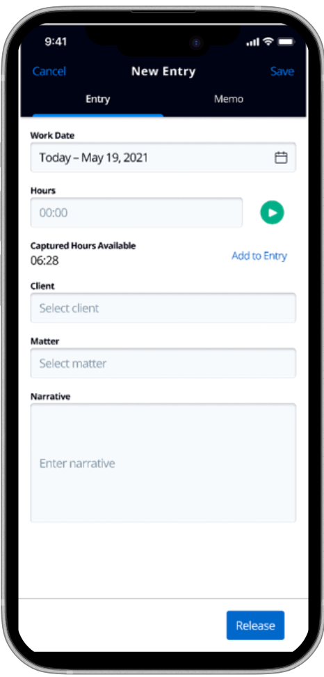
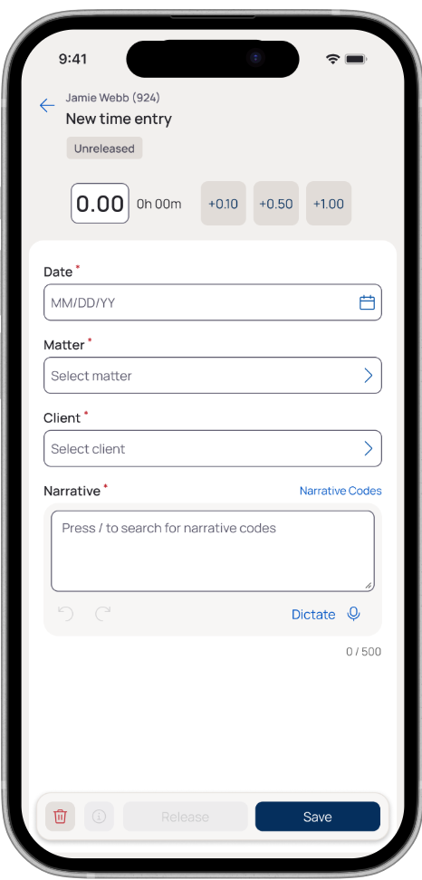
The redesign preserves the familiar entry sequence while clarifying hierarchy, grouping related fields, and keeping primary actions within easy reach.
Legacy
Redesigned
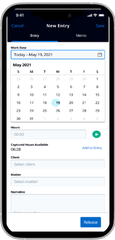
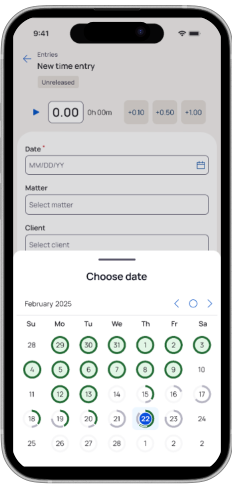
Date selection built for mobile
A focused bottom sheet replaces the expanding in-form calendar, giving date selection a dedicated touch-friendly space.
Legacy
Redesigned
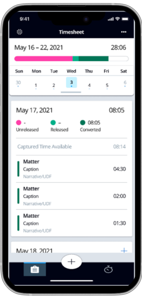
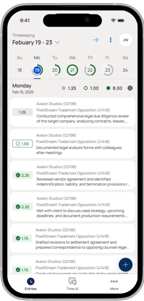
A more useful daily view
The updated timesheet makes daily totals, entry status, and work details easier to scan without abandoning the workflow users already knew.
Legacy
Redesigned
Discovery & Assessment
I conducted a comprehensive review of the existing mobile experience and mapped current workflows against the emerging design system standards.
As part of this assessment, I partnered closely with designers, product managers, and engineers to understand upcoming roadmap initiatives and technical constraints. This helped ensure that any design decisions would not only address current pain points but also support future enhancements planned for the application.
The findings shaped both the modernization effort and the creation of mobile-specific standards. Rather than treating each feature as an isolated redesign, I focused on establishing a scalable foundation that could support upcoming releases while delivering a more cohesive and consistent user experience.
- Desktop-first components did not always translate effectively to mobile
- Navigation patterns lacked consistency
- Mobile actions required excessive taps
- Existing interaction models did not support planned future functionality
Defining Mobile Standards
One of my primary contributions was helping establish mobile interaction patterns that could scale across future releases. These standards became foundational for future mobile features.
Floating Action Buttons
Created guidance for high-priority, contextual actions while maintaining consistency with UDS principles.
Bottom Sheets
Established standards for actions and secondary workflows.
Gesture-Based Interactions
Introduced touch-first patterns for common mobile tasks.
- Long press actions
- Swipe interactions
- Bulk editing workflows
Navigation Evolution
Defined an approach that could evolve with the product.
- Unified bottom navigation
- Floating action experiences
- Future header minimization patterns
Reflections
This project showed that successful design system adoption is more than a visual refresh. It requires adapting standards to real user contexts, identifying platform-specific needs, and creating patterns that enable future growth.
A key lesson from this work was the importance of treating mobile as a companion experience rather than a direct extension of the desktop application. Throughout the project, the team made deliberate decisions about which functionality belonged on mobile and which experiences were better suited for desktop. Instead of attempting to replicate every desktop feature on a smaller screen, we focused on supporting the tasks users needed most while on the go.
This mobile-first mindset helped guide feature prioritization and interaction design decisions. We evaluated new functionality through the lens of mobile usability, ensuring experiences were optimized for touch interactions and shorter user sessions. In some cases, this meant simplifying desktop workflows. In others, it meant introducing mobile-specific capabilities such as gesture-based interactions, streamlined action patterns, and contextual experiences that would not necessarily exist on desktop but provided meaningful value to mobile users.
By establishing mobile-first interaction guidance alongside the design system rollout, I helped create a more cohesive, scalable, and future-ready mobile experience. This new experience not only improved consistency across releases but also supported a strategy that emphasized delivering the right experience for the right platform rather than simply duplicating functionality across devices.
designed for touch
Mobile interaction patterns
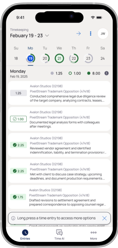
Discoverable long-press actions
Contextual guidance introduces the long-press pattern at the moment it becomes useful.
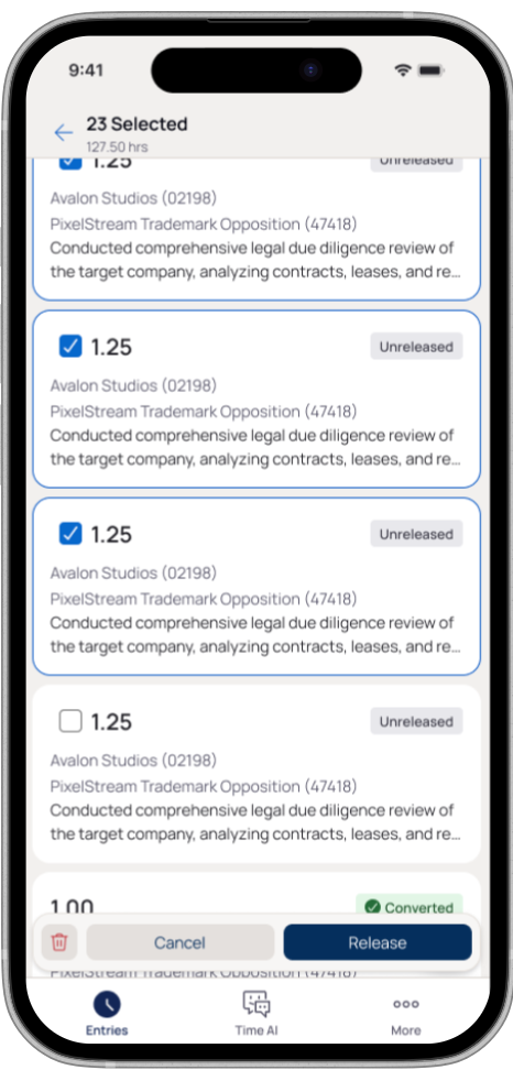
Bulk editing without leaving the list
Selection states and a persistent action bar make multi-entry workflows visible and manageable.
What shipped
- Mobile-specific interaction guidance established alongside the UDS rollout
- Scalable patterns created for upcoming feature releases
- A platform-aware experience that preserves familiar daily workflows