Mobile Dark Mode
Created formal dark mode components for a mobile product suite, aligning two products under one brand while meeting accessibility standards.
- Context
- Design systems · Accessibility
- Role
- Lead Designer
- Timeline
- One quarter
- Tools
- FigmaAha
The problem
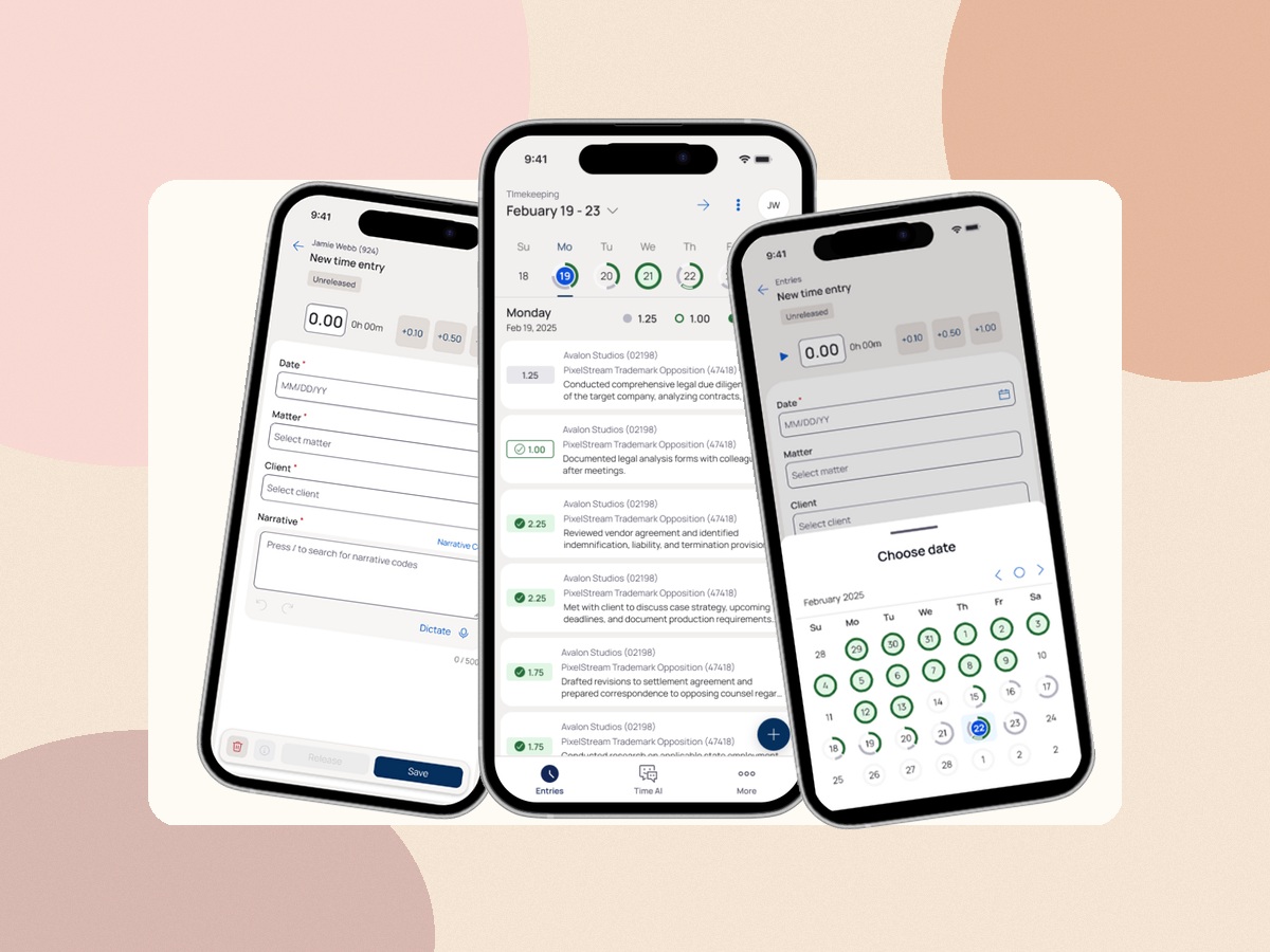
Our updated design system supported light mode only, even though many users had previously used and preferred dark mode. Engineers attempted to supplement dark mode on their own, which led to inconsistent colors, uneven contrast, and unclear rules for when to use which tokens. With two products inside one mobile application, these inconsistencies showed up quickly and threatened brand cohesion. We needed a formal approach that designers and engineers could trust, and it had to meet accessibility considerations from the start.
light meets dark
One system, two themes
Contact details
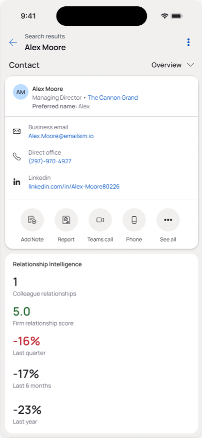
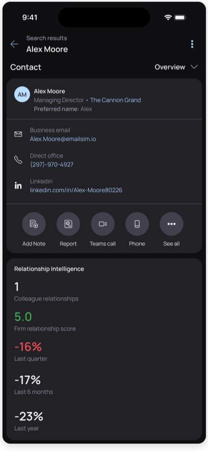
The contact details experience uses consistent surfaces, text hierarchy, links, and status colors across both themes.
Light
Dark
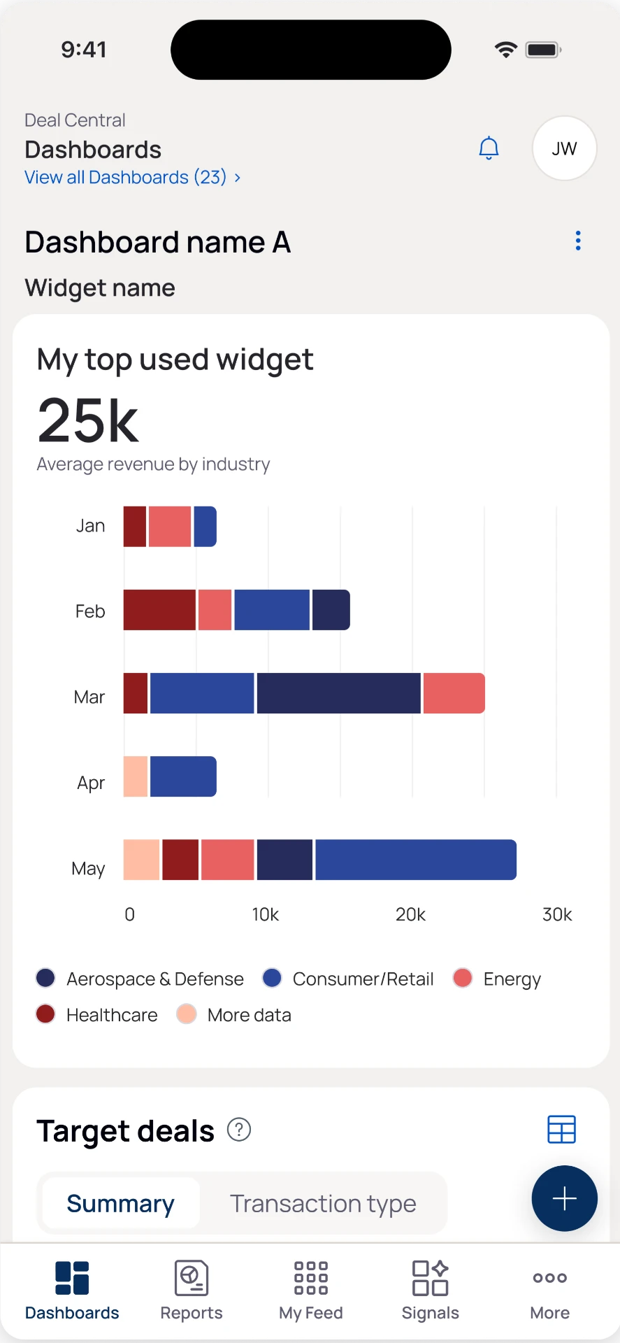
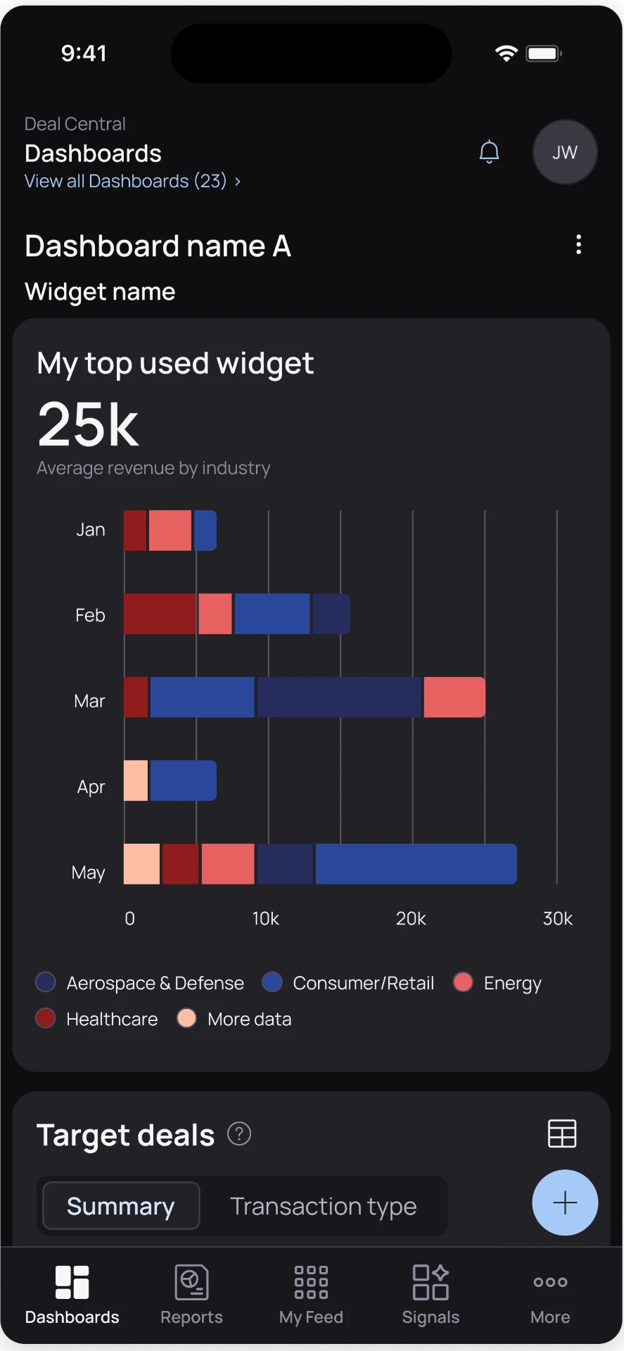
Dashboard
The dashboard preserves chart distinction, navigation hierarchy, and readable data density in light and dark modes.
Light
Dark
Solution
I pulled dark mode out as a dedicated design system effort and created a structured set of dark mode components in Figma, starting with five features that covered the full component set. I collaborated with the design system team to finalize dark theme colors and map them to reusable tokens instead of one off overrides. I defined contrast and state rules (default, pressed, disabled, error) so teams could apply dark mode consistently across both products. The result gave engineering a clear source of truth and gave users a dark mode that felt intentional, consistent, and readable.
What shipped
- Reusable dark theme tokens replaced one off overrides
- Contrast and state rules aligned both products
- Engineering gained a clear source of truth