Data Certification
Partnered with research to redesign a dense certification experience, making status, calls to action, and next steps clearer for users.
- Context
- Financial services · Data governance
- Role
- UX Designer
- Timeline
- 6+ weeks
- Tools
- FigmaJiraMiro
The problem
Users felt overwhelmed by the volume and presentation of information, leading to confusion about what needed to be certified.
Solution
By partnering with research, we engaged directly with users to better understand their pain points. Using their feedback, we updated the process and collaborated with a partner team to streamline the process further.
"Pick yourself up and try again."
Process
- 1Understand
- 2Design
- 3Research/Test
- 4Design
- 5Launch
Initial Data Certification in Production
Initially, leaders received email reminders prompting them to visit our application and complete their data certification each quarter. The primary opportunities for improvement included providing a more effective way to notify users about certification and implementing a clear call to action on the page. Without these enhancements, users often felt uncertain about where to start and which tasks were most important.
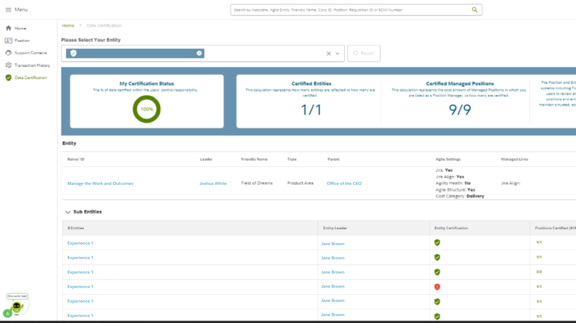
Initial production experience
The original page presented certification status, entities, and positions in a single dense view with limited guidance on where to begin.
Business Requirements and Goals
The goal of the new design was to enhance user satisfaction and create a clearer, more intuitive experience. Data certification is a business-critical process to ensure the accuracy of data for entities and positions. As a relatively new but mandatory task, it naturally comes with some apprehension from users. This made it essential to design an experience that is both useful and as seamless as possible. Through our assessment and research findings, we identified key opportunities to improve the experience, including clearer calls to action, better organization of information, and alignment with our alerting application to consolidate notifications in one place.
First Iteration for the Updated Data Certification Page
Using Figma, I created the first iteration by maintaining the existing page structure while updating elements to align with our new design system standards. Recognizing that the experience itself still needed improvement, my next step was to explore and define a more efficient process that would enhance the overall experience.
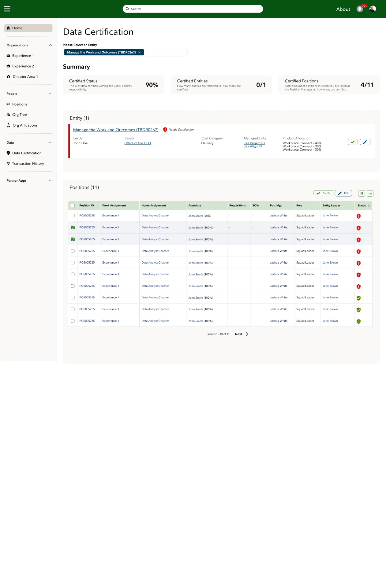
First iteration
The first redesign applied the new design system while keeping the existing structure, surfacing clearer status cards and a more scannable table.
Final Product
A key difference in the final product compared to previous iterations is the inclusion of supplemental text. Recognizing that this new process was still unfamiliar to many users, we identified that adding explanatory text in strategic areas would provide better clarity, enhancing the overall experience. The designs underwent user research, focusing on metrics such as SUS Score, Improvement & Efficiency, and CSAT, all of which showed positive increases.
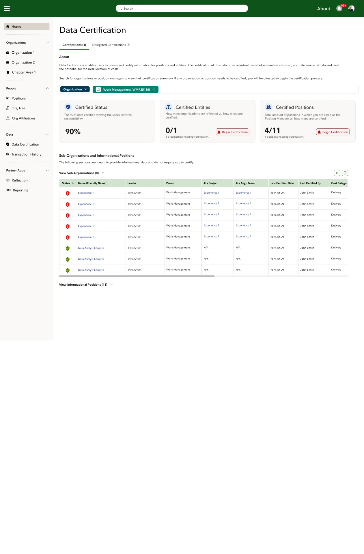
Final Data Certification Design
The final design adds explanatory text, a clearer information hierarchy, and stronger calls to action so users know exactly what to certify.
Improved Experience + Efficiency
Research from our final designs showed that 70% of research participants found the new experience to be an improvement and 73% believed the new experience to be more efficient.
Increased Satisfaction
The CSAT score increased from 41% with a 'needs improvement' rating to 77% with a 'good' rating. While there are additional enhancements discussed in the next section aimed at elevating the experience to excellent, this marks a significant improvement for our users.
What's Next?
Additional enhancements can still be made to further improve the user experience in future sprints. These include increased collaboration and integration with other applications across the organization to reduce fragmentation and create a more cohesive experience for users.
What shipped
- 70% of research participants found the new experience to be an improvement
- 73% believed the new experience was more efficient
- CSAT increased from 41% to 77%